Get responsive with CSS media queries
April 12, 2020
Why use media queries ?
You’ll mainly be using media queries when you want certain CSS rules to apply only for a specific screen width (a.k.a Responsive Design).
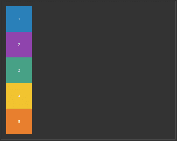
Let’s say you’re rendering several divs using flexbox. With a large screen,
you want to them to be rendered one next to each other (flex-direction: row). However, for smaller screens
(smartphones), you want the divs to be rendered on on top of the other (flex-direction: column).
Here’s what this looks like using CSS media queries
.container {
    display: flex;
    flex-direction: row;
}
/*
##Device = Most of the Smartphones Mobiles (Portrait)
##Screen = B/w 320px to 479px
*/
@media (min-width: 320px) and (max-width: 480px) {
.container {
flex-direction: column;
}
}How does it work ?
Inside a .css file, a media query starts with the keyword @media.
You can then define media features, which describes specific characteristic of the device or environment. Most of
the time, the styling you’ll want to apply in a media query will depend on the browser’s viewport width. Thus,
the most used media features are max-width and min-width. Imagine the media features as conditions that have to
be true if you want the following CSS to be applied.
If you wish to know more about the other media features, I recommend checking the MDN docs (link at the bottom of the article).
In the example above, the default behaviour for the element with class="container" is to be displayed in row.
Then, we define a media query that will depend on the viewport’s with. Between 320 and 479px, a new CSS rule
will overwrite the default behaviour, replacing flex-direction: row with flex-direction: column.
Learn more about media queries
This article covers 90% of the problems you’ll be solving with media queries, and I mainly wrote it because I have to search every single time the syntax to do a media query. I just hope that after writing an article about it, no more googling will be involved.
Here are some great resources if you wish to learn more about media queries :

